Code: Select all
XIncludeFile "ChartDirector.pbi"
Procedure Text_Styles_and_Colors()
Debug "Text_Styles_and_Colors()"
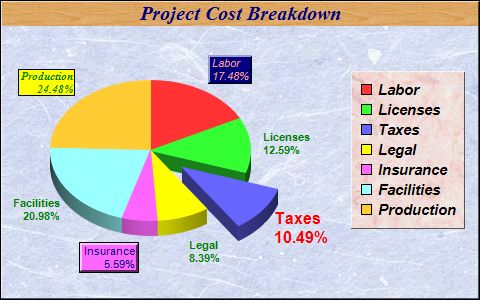
DataSection
; The data for the pie chart
data_022: : Data.d 25, 18, 15, 12, 8, 30, 35
; The labels for the pie chart
labels_022: : Data.i @"Labor", @"Licenses", @"Taxes", @"Legal", @"Insurance", @"Facilities", @"Production"
EndDataSection
; Create a PieChart object of size 480 x 300 pixels
c.PieChart = New_PieChart(480, 300)
If Not c : Debug "c = 0" : ProcedureReturn : EndIf
; Use a blue marble pattern as the background wallpaper, with a black border,
; and 1 pixel 3D border effect
c\setBackground(c\patternColor2("marble.png"), $000000, 1)
; Set the center of the pie at (150, 150) and the radius to 100 pixels
c\setPieSize(150, 150, 100)
; Add a title to the pie chart using Times Bold Italic/15 points/deep blue
; (0x000080) as font, with a wood pattern as the title background
title.TextBox = c\addTitle("Project Cost Breakdown", "timesbi.ttf", 15, $000080)
If Not title : Debug "title = 0" : ProcedureReturn : EndIf
title\setBackground(c\patternColor2("wood.png"))
; Draw the pie in 3D
c\set3D()
; Add a legend box using Arial Bold Italic/11 points font. Use a pink marble
; pattern as the background wallpaper, with a 1 pixel 3D border. The legend box
; is top-right aligned relative to the point (465, 70)
b.LegendBox = c\addLegend(465, 70, #True, "arialbi.ttf", 11)
If Not b : Debug "b = 0" : ProcedureReturn : EndIf
b\setBackground(c\patternColor2("marble2.png"), #Chart_Transparent, 1)
b\setAlignment(#Chart_TopRight)
; Set the default font for all sector labels to Arial Bold/8 pts/dark green
; (0x008000).
c\setLabelStyle("arialbd.ttf", 8, $008000)
; Set the pie data and the pie labels
c\setData(?data_022, 7, ?labels_022, 7)
; Explode the 3rd sector
c\setExplode(2, 40)
; Use Arial Bold/12 pts/red as label font for the 3rd sector
sector.Sector = c\sector(2)
If Not sector : Debug "sector = 0" : ProcedureReturn : EndIf
sector\setLabelStyle("arialbd.ttf", 12, $ff0000)
; Use Arial/8 pts/deep blue as label font for the 5th sector. Add a background
; box using the sector fill color (SameAsMainColor), with a black (0x000000)
; edge and 2 pixel 3D border.
sector = c\sector(4)
If Not sector : Debug "sector = 0" : ProcedureReturn : EndIf
t.TextBox = sector\setLabelStyle("arial.ttf", 8, $000080)
If Not t : Debug "t = 0" : ProcedureReturn : EndIf
t\setBackground(#Chart_SameAsMainColor, $000000, 2)
; Use Arial Italic/8 pts/light red (0xff9999) as label font for the 6th sector.
; Add a dark blue (0x000080) background box with a 2 pixel 3D border.
sector = c\sector(0)
If Not sector : Debug "sector = 0" : ProcedureReturn : EndIf
t = sector\setLabelStyle("ariali.ttf", 8, $ff9999)
If Not t : Debug "t = 0" : ProcedureReturn : EndIf
t\setBackground($000080, #Chart_Transparent, 2)
; Use Times Bold Italic/8 pts/deep green (0x008000) as label font for 7th
; sector. Add a yellow (0xFFFF00) background box with a black (0x000000) edge.
sector = c\sector(6)
If Not sector : Debug "sector = 0" : ProcedureReturn : EndIf
t = sector\setLabelStyle("timesbi.ttf", 8, $008000)
If Not t : Debug "t = 0" : ProcedureReturn : EndIf
t\setBackground($ffff00, $000000)
; Output the chart
c\makeChart(CD_PATH("output\022 - fontpie.jpg"))
; free up resources
delete(c)
EndProcedure
Text_Styles_and_Colors()
Code: Select all
XIncludeFile "ChartDirector.pbi"
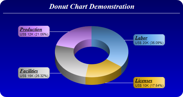
Procedure Donut_Chart_3D()
Debug "Donut_Chart_3D()"
DataSection
; The data for the pie chart
ddat_014: : Data.d 20, 10, 15, 12
; The labels For the pie chart
labels_014: : Data.i @"Labor", @"Licenses", @"Facilities", @"Production"
; The colors to use for the sectors
colors_014: : Data.l $66aaee, $eebb22, $cccccc, $cc88ff
EndDataSection
; Create a PieChart object of size 600 x 320 pixels. Use a vertical gradient
; color from deep blue (000066) to blue (0000cc) as background. Use rounded
; corners of 20 pixels radius.
c.PieChart = New_PieChart(600, 320)
If Not c : Debug "c = 0" : ProcedureReturn : EndIf
c\setBackground(c\linearGradientColor(0, 0, 0, c\getHeight(), $000066, $0000cc))
c\setRoundedFrame($ffffff, 20)
; Add a title using 18 pts Times New Roman Bold Italic font in white (ffffff)
; color. Set top/bottom margins to 8 pixels.
title.TextBox = c\addTitle("Donut Chart Demonstration", "timesbi.ttf", 18, $ffffff)
If Not title : Debug "title = 0" : ProcedureReturn : EndIf
title\setMargin(0, 0, 8, 8)
; Add a separator line in white color just under the title
c\addLine(10, title\getHeight(), c\getWidth() - 11, title\getHeight(), $ffffff)
; Set donut center at (300, 170), and outer/inner radii as 120/60 pixels
c\setDonutSize(300, 170, 120, 60)
; Draw the pie in 3D with a pie thickness of 25 pixels
c\set3D(25)
; Set the pie data and the pie labels
c\setData(?ddat_014, 4, ?labels_014, 4)
; Set the sector colors
c\setColors(#Chart_DataColor, ?colors_014, 4)
; Use local gradient shading for the sectors
c\setSectorStyle(#Chart_LocalGradientShading)
; Set sector border color to same as fill color. Set label join line color to
; white (ffffff)
c\setLineColor(#Chart_SameAsMainColor, $ffffff)
; Use the side label layout method, with the labels positioned 16 pixels from
; the donut bounding box
c\setLabelLayout(#Chart_SideLayout, 16)
; Set the sector label format. The label consists of two lines. The first line
; is the sector name in Times Bold Italic font and is underlined. The second
; line shows the data value and percentage.
c\setLabelFormat("<*block,halign=left*><*font=timesbi.ttf,size=12,underline=1*>{label}<*/font*><*br*>US$ {value}K ({percent}%)")
; Set the label box background color the same as the sector color. Use soft
; lighting effect with light direction from right. Use rounded corners.
t.TextBox = c\setLabelStyle()
If Not t : Debug "t = 0" : ProcedureReturn : EndIf
t\setBackground(#Chart_SameAsMainColor, #Chart_Transparent, Chart_softLighting(#Chart_Right))
t\setRoundedCorners()
; Output the chart
c\makeChart(CD_PATH("output\014 - threeddonut.png"))
; free up resources
delete(c)
EndProcedure
Donut_Chart_3D()
Code: Select all
XIncludeFile "ChartDirector.pbi"
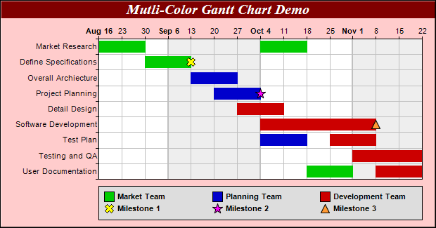
Procedure Multi_Color_Gantt_Chart()
Debug "Multi_Color_Gantt_Chart()"
; The tasks for the gantt chart
Dim labels.s(9)
labels(0) = "Market Research" : labels(1) = "Define Specifications"
labels(2) = "Overall Architecture" : labels(3) = "Project Planning"
labels(4) = "Detail Design" : labels(5) = "Software Development"
labels(6) = "Test Plan" : labels(7) = "Testing and QA"
labels(8) = "User Documentation"
; The task index, start date, end date and color for each bar
Dim taskNo.d(12)
taskNo( 0) = 0 : taskNo( 1) = 0 : taskNo( 2) = 1 : taskNo( 3) = 2
taskNo( 4) = 3 : taskNo( 5) = 4 : taskNo( 6) = 5 : taskNo( 7) = 6
taskNo( 8) = 6 : taskNo( 9) = 7 : taskNo(10) = 8 : taskNo(11) = 8
Dim startDate.d(12)
startDate( 0) = Chart_chartTime(2004, 8, 16) : startDate( 1) = Chart_chartTime(2004, 10, 4)
startDate( 2) = Chart_chartTime(2004, 8, 30) : startDate( 3) = Chart_chartTime(2004, 9, 13)
startDate( 4) = Chart_chartTime(2004, 9, 20) : startDate( 5) = Chart_chartTime(2004, 9, 27)
startDate( 6) = Chart_chartTime(2004, 10, 4) : startDate( 7) = Chart_chartTime(2004, 10, 4)
startDate( 8) = Chart_chartTime(2004, 10, 25) : startDate( 9) = Chart_chartTime(2004, 11, 1)
startDate(10) = Chart_chartTime(2004, 10, 18) : startDate(11) = Chart_chartTime(2004, 11, 8)
Dim endDate.d(12)
endDate( 0) = Chart_chartTime(2004, 8, 30) : endDate( 1) = Chart_chartTime(2004, 10, 18)
endDate( 2) = Chart_chartTime(2004, 9, 13) : endDate( 3) = Chart_chartTime(2004, 9, 27)
endDate( 4) = Chart_chartTime(2004, 10, 4) : endDate( 5) = Chart_chartTime(2004, 10, 11)
endDate( 6) = Chart_chartTime(2004, 11, 8) : endDate( 7) = Chart_chartTime(2004, 10, 18)
endDate( 8) = Chart_chartTime(2004, 11, 8) : endDate( 9) = Chart_chartTime(2004, 11, 22)
endDate(10) = Chart_chartTime(2004, 11, 1) : endDate(11) = Chart_chartTime(2004, 11, 22)
Dim colors.l(12)
colors( 0) = $00cc00 : colors( 1) = $00cc00 : colors( 2) = $00cc00
colors( 3) = $0000cc : colors( 4) = $0000cc : colors( 5) = $cc0000
colors( 6) = $cc0000 : colors( 7) = $0000cc : colors( 8) = $cc0000
colors( 9) = $cc0000 : colors(10) = $00cc00 : colors(11) = $cc0000
; Create a XYChart object of size 620 x 325 pixels. Set background color to
; light red ($ffcccc), with 1 pixel 3D border effect.
c.XYChart = New_XYChart(620, 325, $ffcccc, $000000, 1)
If Not c : Debug "c = 0" : ProcedureReturn : EndIf
; Add a title to the chart using 15 points Times Bold Itatic font, with white
; (ffffff) text on a dark red (800000) background
title.TextBox = c\addTitle("Mutli-Color Gantt Chart Demo", "timesbi.ttf", 15, $ffffff)
If Not title : Debug "title = 0" : ProcedureReturn : EndIf
title\setBackground($800000)
; Set the plotarea at (140, 55) and of size 460 x 200 pixels. Use alternative
; white/grey background. Enable both horizontal and vertical grids by setting
; their colors to grey (c0c0c0). Set vertical major grid (represents month
; boundaries) 2 pixels in width
plotarea.PlotArea = c\setPlotArea(140, 55, 460, 200, $ffffff, $eeeeee, #Chart_LineColor, $c0c0c0, $c0c0c0)
If Not plotarea : Debug "plotarea = 0" : ProcedureReturn : EndIf
plotarea\setGridWidth(2, 1, 1, 1)
; swap the x and y axes to create a horziontal box-whisker chart
c\swapXY()
; Set the y-axis scale to be date scale from Aug 16, 2004 to Nov 22, 2004, with
; ticks every 7 days (1 week)
yAxis.Axis = c\yAxis()
If Not yAxis : Debug "yAxis = 0" : ProcedureReturn : EndIf
yAxis\setDateScale(Chart_chartTime(2004, 8, 16), Chart_chartTime(2004, 11, 22), 86400 * 7)
; Set multi-style axis label formatting. Month labels are in Arial Bold font in
; "mmm d" format. Weekly labels just show the day of month and use minor tick
; (by using '-' as first character of format string).
yAxis\setMultiFormat2(Chart_StartOfMonthFilter(), "<*font=arialbd.ttf*>{value|mmm d}", Chart_StartOfDayFilter(), "-{value|d}")
; Set the y-axis to shown on the top (right + swapXY = top)
c\setYAxisOnRight()
; Set the labels on the x axis
xAxis.Axis = c\xAxis()
If Not xAxis : Debug "xAxis = 0" : ProcedureReturn : EndIf
xAxis\setLabels(@labels(), ArraySize(labels()))
; Reverse the x-axis scale so that it points downwards.
xAxis\setReverse()
; Set the horizontal ticks and grid lines to be between the bars
xAxis\setTickOffset(0.5)
; Add some symbols to the chart to represent milestones. The symbols are added
; using scatter layers. We need to specify the task index, date, name, symbol
; shape, size and color.
coor1.d = 1
date1.d = Chart_chartTime(2004, 9, 13)
c\addScatterLayer(@coor1, 1, @date1, 1, "Milestone 1", Chart_Cross2Shape(), 13, $ffff00)
coor2.d = 3
date2.d = Chart_chartTime(2004, 10, 4)
c\addScatterLayer(@coor2, 1, @date2, 1, "Milestone 2", Chart_StarShape(5), 15, $ff00ff)
coor3.d = 5
date3.d = Chart_chartTime(2004, 11, 8)
c\addScatterLayer(@coor3, 1, @date3, 1, "Milestone 3", #Chart_TriangleSymbol, 13, $ff9933)
; Add a multi-color box-whisker layer to represent the gantt bars
layer.BoxWhiskerLayer = c\addBoxWhiskerLayer2(@startDate(), ArraySize(startDate()), @endDate(), ArraySize(endDate()), 0,0, 0,0, 0,0, @colors(), ArraySize(colors()))
If Not layer : Debug "layer = 0" : ProcedureReturn : EndIf
layer\setXData(@taskNo(), ArraySize(taskNo()))
layer\setBorderColor(#Chart_SameAsMainColor)
; Divide the plot area height ( = 200 in this chart) by the number of tasks to
; get the height of each slot. Use 80% of that as the bar height.
layer\setDataWidth(200 * 4 / 5 / ArraySize(labels()))
; Add a legend box at (140, 265) - bottom of the plot area. Use 8 pts Arial Bold
; as the font with auto-grid layout. Set the width to the same width as the plot
; area. Set the backgorund to grey (dddddd).
legendBox.LegendBox = c\addLegend2(140, 265, #Chart_AutoGrid, "arialbd.ttf", 8)
If Not legendBox : Debug "legendBox = 0" : ProcedureReturn : EndIf
legendBox\setWidth(461)
legendBox\setBackground($dddddd)
; The keys for the scatter layers (milestone symbols) will automatically be
; added to the legend box. We just need to add keys to show the meanings of the
; bar colors.
legendBox\addKey("Market Team", $00cc00)
legendBox\addKey("Planning Team", $0000cc)
legendBox\addKey("Development Team", $cc0000)
; Output the chart
c\makeChart(CD_PATH("output\103 - colorgantt.png"))
; free up resources
delete(c)
EndProcedure
Multi_Color_Gantt_Chart()
Code: Select all
XIncludeFile "ChartDirector.pbi"
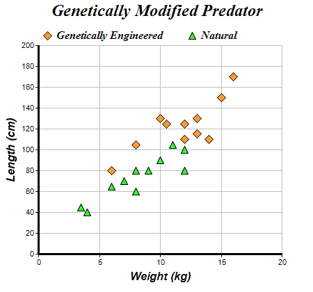
Procedure Scatter_Chart()
Debug "Scatter_Chart()"
DataSection
; The XY points for the scatter chart
dataX0_078: : Data.d 10, 15, 6, 12, 14, 8, 13, 13, 16, 12, 10.5
dataY0_078: : Data.d 130, 150, 80, 110, 110, 105, 130, 115, 170, 125, 125
dataX1_078: : Data.d 6, 12, 4, 3.5, 7, 8, 9, 10, 12, 11, 8
dataY1_078: : Data.d 65, 80, 40, 45, 70, 80, 80, 90, 100, 105, 60
EndDataSection
; Create a XYChart object of size 450 x 420 pixels
c.XYChart = New_XYChart(450, 420)
If Not c : Debug "c = 0" : ProcedureReturn : EndIf
; Set the plotarea at (55, 65) and of size 350 x 300 pixels, with a light grey
; border ($c0c0c0). Turn on both horizontal and vertical grid lines with light
; grey color ($c0c0c0)
c\setPlotArea(55, 65, 350, 300, -1, -1, $c0c0c0, $c0c0c0, -1)
; Add a legend box at (50, 30) (top of the chart) with horizontal layout. Use 12
; pts Times Bold Italic font. Set the background and border color to
; Transparent.
legend.LegendBox = c\addLegend(50, 30, #False, "timesbi.ttf", 12)
If Not legend : Debug "legend = 0" : ProcedureReturn : EndIf
legend\setBackground(#Chart_Transparent)
; Add a title to the chart using 18 pts Times Bold Itatic font.
c\addTitle("Genetically Modified Predator", "timesbi.ttf", 18)
; Add a title to the y axis using 12 pts Arial Bold Italic font
yAxis.Axis = c\yAxis()
If Not yAxis : Debug "yAxis = 0" : ProcedureReturn : EndIf
yAxis\setTitle("Length (cm)", "arialbi.ttf", 12)
; Add a title to the x axis using 12 pts Arial Bold Italic font
xAxis.Axis = c\xAxis()
If Not xAxis : Debug "xAxis = 0" : ProcedureReturn : EndIf
xAxis\setTitle("Weight (kg)", "arialbi.ttf", 12)
; Set the axes line width to 3 pixels
xAxis\setWidth(3)
yAxis\setWidth(3)
; Add an orange ($ff9933) scatter chart layer, using 13 pixel diamonds as
; symbols
c\addScatterLayer(?dataX0_078, 11, ?dataY0_078, 11, "Genetically Engineered", #Chart_DiamondSymbol, 13, $ff9933)
; Add a green ($33ff33) scatter chart layer, using 11 pixel triangles as
; symbols
c\addScatterLayer(?dataX1_078, 11, ?dataY1_078, 11, "Natural", #Chart_TriangleSymbol, 11, $33ff33)
; Output the chart
c\makeChart(CD_PATH("output\078 - scatter.png"))
; free up resources
delete(c)
EndProcedure
Scatter_Chart()
Code: Select all
XIncludeFile "ChartDirector.pbi"
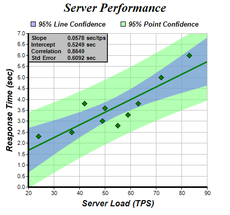
Procedure Confidence_Band()
Debug "Confidence_Band()"
DataSection
; The XY data of the first data series
dataX_075: : Data.d 50, 55, 37, 24, 42, 49, 63, 72, 83, 59
dataY_075: : Data.d 3.6, 2.8, 2.5, 2.3, 3.8, 3.0, 3.8, 5.0, 6.0, 3.3
EndDataSection
; Create a XYChart object of size 450 x 420 pixels
c.XYChart = New_XYChart(450, 420)
If Not c : Debug "c = 0" : ProcedureReturn : EndIf
; Set the plotarea at (55, 65) and of size 350 x 300 pixels, with white
; background and a light grey border ($c0c0c0). Turn on both horizontal and
; vertical grid lines with light grey color ($c0c0c0)
c\setPlotArea(55, 65, 350, 300, $ffffff, -1, $c0c0c0, $c0c0c0, -1)
; Add a title to the chart using 18 point Times Bold Itatic font.
c\addTitle("Server Performance", "timesbi.ttf", 18)
; Add titles to the axes using 12 pts Arial Bold Italic font
yAxis.Axis = c\yAxis()
If Not yAxis : Debug "yAxis = 0" : ProcedureReturn : EndIf
yAxis\setTitle("Response Time (sec)", "arialbi.ttf", 12)
xAxis.Axis = c\xAxis()
If Not xAxis : Debug "xAxis = 0" : ProcedureReturn : EndIf
xAxis\setTitle("Server Load (TPS)", "arialbi.ttf", 12)
; Set the axes line width to 3 pixels
yAxis\setWidth(3)
xAxis\setWidth(3)
; Add a scatter layer using (dataX, dataY)
c\addScatterLayer(?dataX_075, 10, ?dataY_075, 10, "", #Chart_DiamondSymbol, 11, $008000)
; Add a trend line layer for (dataX, dataY)
trendLayer.TrendLayer = c\addTrendLayer2(?dataX_075, 10, ?dataY_075, 10, $008000)
If Not trendLayer : Debug "trendLayer = 0" : ProcedureReturn : EndIf
; Set the line width to 3 pixels
trendLayer\setLineWidth(3)
; Add a 95% confidence band for the line
trendLayer\addConfidenceBand(0.95, $806666ff)
; Add a 95% confidence band (prediction band) for the points
trendLayer\addPredictionBand(0.95, $8066ff66)
; Add a legend box at (50, 30) (top of the chart) with horizontal layout. Use 10
; pts Arial Bold Italic font. Set the background and border color to
; Transparent.
legendBox.LegendBox = c\addLegend(50, 30, #False, "arialbi.ttf", 10)
If Not legendBox : Debug "legendBox = 0" : ProcedureReturn : EndIf
legendBox\setBackground(#Chart_Transparent)
; Add entries to the legend box
legendBox\addKey("95% Line Confidence", $806666ff)
legendBox\addKey("95% Point Confidence", $8066ff66)
; Display the trend line parameters as a text table formatted using CDML
buffer.s = "<*block*>Slope"+#LF$+"Intercept"+#LF$+"Correlation"+#LF$+"Std Error<*/*> <*block*>"
buffer + StrD( trendLayer\getSlope() , 4) + " sec/tps"+#LF$
buffer + StrD( trendLayer\getIntercept() , 4) + " sec"+#LF$
buffer + StrD( trendLayer\getCorrelation(), 4) + #LF$
buffer + StrD( trendLayer\getStdError() , 4) + " sec<*/*>"
textbox.TextBox = c\addText(56, 65, buffer, "arialbd.ttf", 8)
If Not textbox : Debug "textbox = 0" : ProcedureReturn : EndIf
; Set the background of the text box to light grey, with a black border, and 1
; pixel 3D border
textbox\setBackground($c0c0c0, 0, 1)
; Output the chart
c\makeChart(CD_PATH("output\075 - confidenceband.png"))
; free up resources
delete(c)
EndProcedure
Confidence_Band()